My Body, My Choice: Abortions in New York City

CODE:
result = df['Fake_clinic'].groupby(df['Borough']).value_counts()
result.plot(kind='barh', x='Borough')
plt.xlabel("Number of clinics")
plt.ylabel("Borough with Fake clinics")
plt.title("Regional Locations of Fake Abortion Clinics")
plt.show()
DATA EXPLAINED:
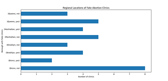
The visualizations on the left is presenting the regional locations of real and fake abortion clinics/centers with their matching boroughs. This shows that the abortion clinics that are real and offering legal, safe procedures are mostly in the Bronx, while the most fake clinics seem to be residentially in Queens. Similarly, Brooklyn and Queens have more fake clinics that are present to date than real clinics, as the visualization shows that there's 5 fake clinics compared to 3 real clinics in Queens and 4 fake clinics compared to 3 real clinics in Brooklyn. Despite Manhattan having more real clinics than fake clinics, Manhattan homes the second largest amount of fake clinics after Queens. Therefore, this shows that my hypothesis of Brooklyn having more fake clinics compared to other boroughs is incorrect, as Queens shows to have more fake clinics.
TECHNIQUE:
The technique used here is use groupby() function from the pandas package in Python to find the fake clinics based on the boroughs while counting the number of those specified values with the value_count() function. Then, using the .plot() function with the parameters being set to the kind being a bar graph and the x value being boroughs, The remaining four lines after sets the names and values in the right order and displays the graph.
DATA EXPLAINED:
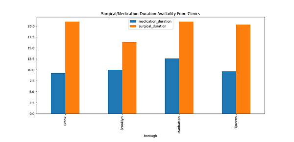
The visualization on the right shows the comparison of the medication and surgical duration administered in relation to their boroughs. The graph shows that the Bronx and Manhattan give the longest duration when it comes to surgical duration, as it is a little over 20 weeks, and Queens came in second for longest duration with 20 weeks. The highest duration for medication is administered in Manhattan, with a maximum of 12.5 weeks, and the lowest durations belong to Bronx and Queens, with below 10 weeks. Therefore, this shows that most availability and stretch for a duration can be readily accessed in Manhattan, as both medication and surgical abortions are performed with more timespan there than any other borough. Also, Brooklyn and Queens have the lowest compared to the other boroughs in terms of medication abortion and surgical abortions. This shows there are less access for communities, mainly people of color and un-wealthy areas, compared to Manhattan, who have a percentage of wealthier community residing.
TECHNIQUE:
The technique used here is using SQL, as my selected values are borough, medication duration and surgical duration from the abortion csv file and grouped by the boroughs. Then, using sqldf function from the pandas sql package, I converted the sql into a data frame and converted the data frame information into a bar graph, similarly to the process from the previous. The different bar colors and graphs were given by the specifications on the y-axis of the function for plotting.

CODE:
q1 = 'select `Borough` as borough, avg(`Surgical_duration`)as surgical_duration, avg(`Medication_duration`) as medication_duration from workingfile group by Borough'
q1_columns = sqldf(q1)
df1 = pd.DataFrame(q1_columns)
df1.plot(x='borough', y=['medication_duration', 'surgical_duration'], kind="bar")
plt.title("Surgical/Medication Duration Availaility From Clinics")
plt.show()